Hey,
Welcome to the 11th edition of Ad Pulse Monday!
For those new to this series, every Monday, I select an ad or ads that I believe have performed exceptionally well. I’ll break down their success factors, key takeaways, and how you can apply these insights to your business.
If you’re already familiar with Ad Pulse Monday, welcome back!
Consider bookmarking these posts, creating a handy repository right in your browser.
Without further ado, let’s dive in!
Ad for Coding Ninjas

Watch the complete ad here: https://app.minea.com/en/ads/facebook/122124081266140604/details?ref=k63dd
1. Thumbnail score:
This one’s a solid 5 out of 5 for me. If you’re a coder, this would totally grab your attention.
It’s spot-on for the target audience and is bound to make people pause and take a closer look.
2. Hook Score:

Another perfect score, 5 out of 5, from me. Full disclosure: I’ve been a coder in the past.
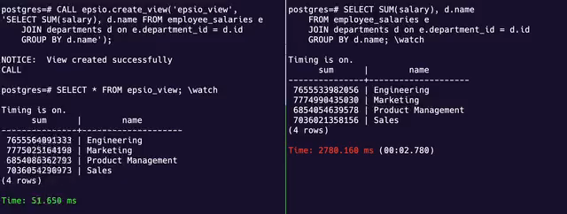
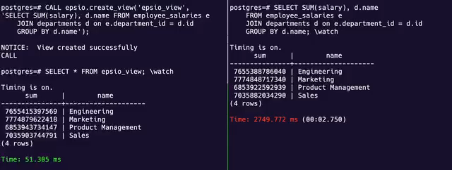
So, as someone who’s interested in this ad, the moving numbers and running query would definitely pique my interest, and I’d want to keep watching to see what’s going on.
3. Retention Score:
I’m giving this a 5 out of 5. The ad is short, and there’s so much going on that I’d want to make sense of it all.
I’d even watch it on repeat because it’s impossible to grasp everything in one go, which is going to boost the retention rate.
4. Click Score:
I’m rating this a 3 out of 5. The ad doesn’t give me enough motivation to click on it. I’ve seen everything in the video, but it doesn’t entice me by explaining what I’ll get once I click on the landing page.
We don’t click on everything, after all. Of course, if I need the solution right now, I might click on it, but the ad could have done a lot more to make me want to click.
They could have added a value proposition or a better call-to-action (CTA). Right now, it feels like a missed opportunity.
5. Ugly Score:
This is a perfect 5 out of 5. There is no debate here. It uses a screen recording of the SQL interface, which suits the context and doesn’t make it look like an ad.
It looks like this ad was made by a coder, not a marketing professional, and that’s a huge win!
Caption:
This gets a 2 out of 5 from me. They really dropped the ball with this caption.
The ad would have been so much better if they had just added some benefits, used emojis, and added line breaks to make the caption more appealing.
This would have enticed people to click on the ad and visit the landing page because, in the end, aren’t we all looking for traffic on our websites.
How can you use this for your business?
- Keep your ad duration short but packed with content to encourage repeat views and boost retention.
- Make sure your ad clearly communicates what viewers will gain by clicking through, using a strong value proposition or call to action.
- Consider using an ‘ugly’ or amateur aesthetic that fits the context of your ad, making it more relatable and less like a traditional ad.
- Improve your caption by adding benefits, using emojis, and formatting with line breaks to make it more appealing and clickable.
Check Out the Landing Page:
Here’s the landing page for this product: https://docs.epsio.io/
This post is packed with insights; I again recommend bookmarking it in your browser for future reference.
Well, that’s all for the post, folks!
Finally, I would like to add that I will continue sending you these ads every Monday, but they alone may not be sufficient for your success as you would want more concepts under your belt.
Therefore, if you are a Facebook ads marketer and want more ads like these for yourself, then go ahead and check out Minea.
Here is the promo code offering you 20% off for 3 months: SANNIDHYA20
And here is my affiliate link: [https://app.minea.com/find-winning-product?ref=k63dd]
Also, let me know which niche’s ad I should pick up next for you. I would love to hear from you.
DISCLAIMER: This post contains affiliate links, which means that if you click on one of the product links, I’ll receive a small commission.