
Hey,
Welcome to the 103rd edition of Ad Pulse Monday!
For those new to this series, every Monday, I select an ad or ads that have performed exceptionally well. I’ll break down their success factors, key takeaways, and how you can apply these insights to your business.
If you’re already familiar with Ad Pulse Monday, welcome back!
Consider bookmarking these posts, creating a handy repository right in your browser.
Without further ado, let’s dive in
Breaking Down the Island Recreational Pool Liner Ad
1. Thumbnail Score
I give this a 5 out of 5.
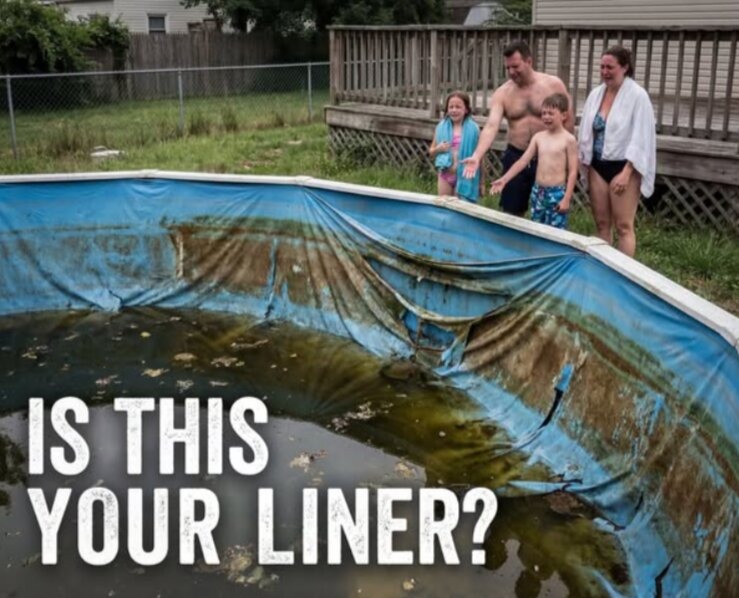
This is a really good static image. It uses an extremely vivid image of a dirty pool to rouse strong emotional reactions.
By targeting disgusted reactions from viewers, the image creates a massive pattern interrupt on the feed.
One look at the dirty pool, the ripped liner, and the crying family forces viewers to stop their scroll to understand the reason for such a strong visual.
It is an immediate scroll stopper. The filthy visual triggers an instant emotional reaction for any pool owner.
The bold white text overlay on the right reads “IS THIS YOUR LINER?”, which aggressively calls out the pain point of the target audience.
As a completely unpolished and messy picture, it highlights a worst-case scenario that homeowners desperately want to avoid.
2. Click score:
This earns a 4 out of 5.
The shocking image creates a high thumbstop rate that can lead to high CTRs on its own.
Many people will click out of pure curiosity, which can get you high LPVs.
Once you look past the shocking image, you become curious about the caption.
It does a good job of drawing your attention to the caption, prompting you to search for a solution to the problem in the image.
Caption:
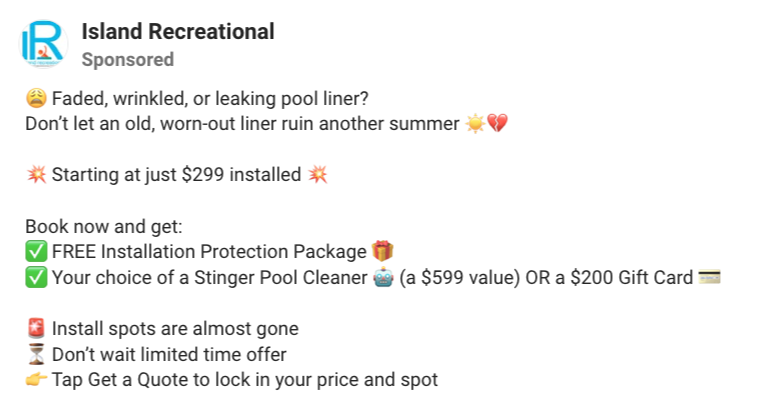
The hook is disappointing. It poses the direct problem as a question and tells viewers not to let a bad liner ruin their summer.
While it uses easy, relatable language, the hook could have used more vivid, descriptive words to elicit the same reaction as the image.
Using emojis is a good thing, as it humanizes the copy and adds emotional context for the viewer.
Right after the hook is an offer line that promotes the starting offer, using explosion emojis to highlight its urgency.
The price is also clearly stated, removing doubt for viewers at first glance.
Following the offer is a bonus list, guided by green checkpoint emojis, that breaks down the biggest benefits, such as a free installation package, a $200 gift card, or a $599 pool cleaner.
The final list is a classic scarcity tactic that states that spots are limited, pushing the viewers to a “Get a Quote” CTA to utilize the offer.
It’s also guided by various emojis, all of which draw visual interest while clearly highlighting the options for easy scanning.
The caption that does an okay job of driving clicks. It will turn cold traffic into leads with the offer.
But the hook can be improved, and product features can be added.
Headline:
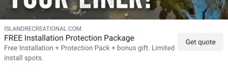
The ad’s headline promotes the free installation package offer.
It is a basic headline that serves its purpose. It will attract customers looking to take advantage of the offer.
While it is fine, it could have again exploited the image’s shocking nature to hint at a solution.
For example: “I’ll never have dirty and leaking liners again” or “This summer, your pool liner deserves an upgrade.”
These tap into buyers’ psychology while building on the image ad. It achieves both emotional targeting and hints at the solution with the product, prompting users to click on the ad to satisfy their curiosity.
Description:
The description repeats the offer and adds a line to create urgency by mentioning the limited spots.
It’s repetitive and forgettable. Instead of repeating the offer, the text could have expanded on the product’s benefits.
The urgency line can stay, but the core point of attraction should not be limited to the offer alone.
There should be a stronger product focus to ensure high-intent leads.
A line like “Unsurpassed Gauge” or “Industry-leading liner” could have done a better job.
3. Ugly score:
This earns a 4.5 out of 5.
This is a truly ugly ad. It embraces the “ugly” framework in its entirety.
The image looks like an unedited photo taken on an old camera rather than one taken with a high-budget camera.
It can still look ‘uglier’ if it was shot on an iPhone.
Coupled with the pool’s murky green water, the overcast skies, and the family’s miserable expressions, the image looks incredibly authentic and raw.
It looks like a shocking viral post a neighbor would share.
Though there are no native social media elements, the image still avoids shiny, artificial graphics and instead relies on the real, relatable misery of a bad pool liner.
4. Congruency Score:
This gets a score of 3 out of 5.
The landing page is clean and polished, creating a stark contrast to the ugly ad creative.
Upon reaching the page, the first fold features a box with the product name, three points about the offer, and a “Get Your Free Quote” CTA button set against an image of a clean pool.
The copy under the product name reads “The last pool liner you’ll ever buy — built thick, engineered smarter, and backed by a double lifetime warranty. No other pool company can do this.”
At first glance, it doesn’t align with the ad image. There is no product image or any reference to the image ad.
Because of this, there is a disconnect that makes the page feel less trustworthy.
The second fold shows the product setup and its manufacturing process in different videos.
It does a good job of creating credibility for the brand.
The next scroll shows a product features section, a “Did You Know” section, and a large section that describes the benefits of the Installation Package.
They do an okay job of trying to convince viewers of their product and service, but it feels lacking because it’s all from the brand’s perspective.
There are no customer testimonials to give weight to their claims.
Furthermore, the latter half of the page shows a small social proof section stating they are “always here, always open, always showing up,” with metrics including “120K+ Pools Installed, 20M+ Transactions and 4,000+ LI Employees”.
It finally gives the viewer something concrete to trust, but it’s a bit too little, and it’s too far down the page.
Ideally, the social proof should’ve been put near the top of the page to create trust and credibility immediately.
The page finishes with a section on Guarantees. It lacks an FAQ or review section to address customers’ doubts.
The truth is, nothing convinces buyers more than reviews and testimonials. So the page, which doesn’t feature anything beyond a broad social proof metric, is a missed opportunity.
Overall, it’s an okay landing page that isn’t really good enough to create quality conversions beyond people who want to use the offer.
How can you use this for your business?
- Agitate the problem visually: Show the absolute worst-case scenario of your customer’s problem to break their scroll.
- Leverage emotions to create curiosity gaps: Always take advantage of strong emotions to point them towards the solution without directly naming the solution
- Make sure your landing page is credible: Offers aren’t always enough to convert high-quality leads. To get them, make sure the landing page is trustworthy and backed by testimonials and reviews that support your claims.
Main insights from the ad
What works well:
- The dirty pool and the sad family visual serve as a great, high thumbstop rate pattern interrupt.
- Using curiosity gaps from the ugly image itself drives clicks
- Value offers create high-intent leads from a warm audience while enticing cold audiences.
What the ad can improve:
- The caption could be better by highlighting the product’s features
- The landing page needs to be more informative and credible
Check Out the Landing Page:
This post is packed with insights; I again recommend bookmarking it in your browser for future reference.
Well, that’s all for the post, folks!
Happy Marketing!