Hey,
Welcome to the 89th edition of Ad Pulse Monday!
For those new to this series, every Monday, I select an ad or ads that have performed exceptionally well. I’ll break down their success factors, key takeaways, and how you can apply these insights to your business.
If you’re already familiar with Ad Pulse Monday, welcome back!
Consider adding a label to these emails for easy access, just like Shailendra did, creating a handy repository right in your inbox.
To view the ad, register on Minea using this affiliate link (and get a flat 20% discount on paid plans):
https://app.minea.com/ads/facebook?ref=k63dd
Then, you can click on this link:
https://app.minea.com/en/ads/facebook/676451191150827/details?ref=k63dd
1. Thumbnail Score:
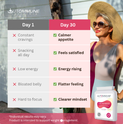
I give the thumbnail a score of 4 out of 5. The thumbnail shows a split-screen comparison: “Day 1” vs “Day 30” with a woman in a white swimsuit and sun hat at the beach. The left side (Day 1) lists problems with red X marks: constant cravings, snacking all day, low energy, bloated belly, hard to focus. The right side (Day 30) shows results with green checkmarks: calmer appetite, feels satisfied, energy rising, flatter feeling, clearer mindset.
What works brilliantly:
- Before/after comparison creates instant curiosity
- The pink/white color blocking is visually striking
- Lists specific, relatable problems that women face while dieting
- Shows tangible benefits in just 30 days (realistic timeline)
- Beach setting suggests summer body transformation
- Product bottle visible in bottom right for brand recognition
- Clean, professional design that feels trustworthy
What could be improved:
- The woman’s body doesn’t show visible transformation (same photo on both sides)
- Small disclaimer at bottom is barely readable but necessary
- Could use a more prominent headline like “30-Day Transformation”
- The autoimmune branding is subtle—could be more prominent
This is a solid thumb-stopper. The side-by-side comparison format is proven to work, and the specific benefit callouts (not just “lose weight”) make it more credible. However, using the same photo for both days might create skepticism—people expect to see actual body transformation.?”
2. Click Score:
I’d give a click score of 3.5 out of 5.
The ad builds curiosity with a clear day by day transformation story, but it still leaves important persuasion gaps unaddressed.
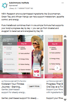
Caption
“NEW: Research shows plant based ingredients like Glucomannan, Green Tea, and African Mango can help support metabolism, appetite control, and energy.”
The science angle and “plant based” appeal work well, but the copy cuts off before delivering the real punch. It needs to emphasize expected results, not just ingredients.
Headline
“Kickstart Your Fitness Journey Starting…”
The headline is supportive and positive, but generic. It could be stronger by highlighting what changes by Day 30, 60, and 90. Something like “From bloated to balanced in 90 days” would tap deeper into emotion.
Description
Currently describes features, not outcomes. There is no mention of:
• how much weight someone could lose
• how soon they feel a difference
• social proof from thousands of users
• guarantee or savings
• it needs a sharper promise to convert curiosity into clicks.
Thumbnail (the three slide carousel)
The progression concept is the strongest part of the ad:
• Slide 1: Day 1 to Day 30 visual transformation
• Slide 2: Day 30 to Day 60 improvements
• Slide 3: Day 60 to Day 90 final results
Each slide highlights common struggles like bloating, cravings, low energy, and slow digestion. These are relatable pain points and seeing them improve step by step builds belief. The smiling women reinforce confidence and emotional payoff.
But there is still room to push harder:
• We do not see actual weight numbers or inches lost
• No before after measurement photos
• No real user faces or testimonials supporting the claims
• No limited time offer or urgency message inside the slides
The transformation structure is smart and visual, but the ad needs stronger proof and a clearer incentive to boost click through rates. It is close to powerful. It just needs the skin in the game that makes someone think, “This will finally work for me.”
3. Ugly Score:
I will give this ad an ugly score of 2 out of 5. The design is neat and visually consistent which helps with trust in a supplement category, but it still feels very polished and brand controlled.
What works:
• The structured Day 1, Day 30, Day 60, Day 90 progression feels easy to follow
• Clean icons and labels make the benefits feel legitimate
• The transformation timeline taps into hope and motivation
What feels too perfect:
• The images look like polished fitness stock photos rather than real customers
• Zero skin texture, zero bloating shown, zero visible struggle
• The same staged composition across slides makes every result look pre planned
• No handwritten notes, no real settings like kitchens or bathrooms
How to make this uglier and more believable:
• Swap the perfectly posed model with authentic selfies from real users
• Show a little chaos. A messy kitchen counter. A bathroom scale on the floor.
• Add texture. A slight belly outline on Day 1. A relaxed waistline on Day 30.
• Include tiny imperfections that prove it is not staged
Examples:
• A sticky note on the supplement bottle that says “Day 30. Feeling lighter already”
• A fridge shot showing junk food on Day 1 and healthy swaps by Day 60
The persuasion rule here:
People want to believe the timeline, but they will not trust it until they see real people and real progress.
Right now, it looks like an ad. You want it to look like someone’s actual journey.
4. Congruency Score:
I will give this ad a congruency score of 3.5 out of 5.
The landing page maintains strong alignment with the ad’s messaging.
What works exceptionally well:
- Headline immediately addresses the core promise: “Quiet late-night cravings, burn calories, stay energized”
- Expands on each benefit from the ad (appetite control, energy, metabolism)
- Explains the science behind Glucomannan (expands in stomach)
- Addresses yo-yo dieting problem (huge pain point)
- Shows the 4 key ingredients with detailed explanations
- Clear dosage instructions (2 capsules before meals)
- Timeline of results (immediate fullness, 1-2 weeks for control, long-term benefits)
- FAQ section covers all objections
- Made in UK adds quality signal
What’s strong about the science section: They explain HOW each ingredient works:
- Glucomannan: Creates fullness
- Zinc: Maintains metabolism during calorie restrictionChromium: Stabilizes blood sugar and cravings
- Vitamin B6: Converts food to energy efficiently
This builds credibility and differentiates from generic “weight loss pills.”
What could improve:
- Limited testimonials (needs more social proof above the fold)
- No before/after photos from real customers
- Price isn’t immediately visible
- Missing comparison to other weight loss supplements
- No urgency or limited-time offer
- Could use video testimonials showing transformations
The page is informative and professional, but needs more emotional proof and urgency to maximize conversions.
How Can You Use This For Your Business?
1. Use comparison charts for tangible before/after
The “Day 1 vs Day 30” format is brilliant because it:
- Makes abstract benefits concrete and visual
- Sets realistic timeline expectations (not “overnight results”)
- Shows multiple improvements, not just weight loss
- Addresses emotional benefits (focus, satisfaction) not just physical
Apply this framework:
- Skincare: “Week 1 vs Week 4” (dull skin → glowing)
- Productivity app: “Before vs After” (scattered → organized)
- Fitness program: “Month 1 vs Month 3” (weak → strong)
- Course: “Day 0 vs Day 90” (confused → confident)
List 4-5 specific transformations, not just one generic benefit.
2. Address the emotional struggles, not just outcomes
This ad doesn’t just say “lose weight.” It addresses:
- Constant cravings (the daily battle)
- Snacking all day (the guilt)
- Low energy (the afternoon crash)
- Bloated belly (the discomfort)
- Hard to focus (the brain fog)
Why this matters: People don’t just want to lose weight. They want to stop feeling out of control around food. They want energy to play with their kids. They want to feel comfortable in their clothes.
For your products:
- Don’t just sell “better sleep”—sell “stop dreading bedtime” and “wake up actually refreshed”
- Don’t just sell “learn Spanish”—sell “stop feeling embarrassed when you can’t order food in Mexico”
- Don’t just sell “time management”—sell “stop feeling like a bad parent because work consumed your evening”
The emotional problem is always more powerful than the functional solution.
3. Explain the science without sounding boring
This landing page nails the balance between credibility and readability. Each ingredient gets:
- What it is
- How it works
- What benefit you’ll experience
The formula: “[Ingredient] works by [mechanism] so you can [benefit]”
Example: “Glucomannan absorbs water in your stomach, forming a gel-like substance, so you feel full even when eating less.”
Apply this to your products:
- Don’t just say “contains probiotics”—explain “probiotics colonize your gut, crowding out bad bacteria, so you experience less bloating and better digestion”
- Don’t just say “uses AI”—explain “AI learns your patterns and automates repetitive tasks, so you save 10 hours per week”
Science builds trust. But only if people understand it.
4. Lead with the mechanism, not just the outcome
Most weight loss ads say “lose weight fast.” This ad explains HOW:
- Glucomannan expands in your stomach → you feel full → eat less → lose weight
- Chromium stabilizes blood sugar → no energy crashes → no cravings → stick to diet
- Zinc maintains metabolism during calorie restriction → avoid yo-yo effect → keep weight off
Why mechanism matters:
- Makes the promise believable
- Differentiates from competitors
- Appeals to logical, skeptical buyers
- Justifies the price point
Apply this thinking:
- Not “get more leads”—explain “AI identifies your ideal customer profile, finds lookalikes, and automates personalized outreach = 3x more qualified leads”
- Not “sleep better”—explain “Magnesium relaxes muscles, melatonin regulates circadian rhythm, and L-theanine reduces racing thoughts = deep, restorative sleep”
Show your work. Let people understand WHY it works, not just that it does.
Check out their Landing Page:
Here’s the landing page for this product:
https://autoimmune-institute.com/pages/pure-metaboost
This post is packed with insights; I again recommend bookmarking it in your browser for future reference.
Well, that’s all for the newsletter, folks!
Finally, I would like to add that I will continue sending you these ads every Monday, but they alone may not be sufficient for your success as you would want more concepts under your belt.
Therefore, if you are a Facebook ads marketer and want more ads like these for yourself, then go ahead and check out Minea.
Here is the promo code offering you 20% off for 3 months: SANNIDHYA20
And here is my affiliate link: [https://app.minea.com/find-winning-product?ref=k63dd]
Also, let me know which niche’s ad I should pick up next for you. I would love to hear from you.
DISCLAIMER: This post contains affiliate links, which means that if you click on one of the product links, I’ll receive a small commission.
Happy Marketing!