Hey,
Welcome to the 96th edition of Ad Pulse Monday!
For those new to this series, every Monday, I select an ad or ads that have performed exceptionally well. I’ll break down their success factors, key takeaways, and how you can apply these insights to your business.
If you’re already familiar with Ad Pulse Monday, welcome back!
Consider adding a label to these emails for easy access, just like Shailendra did, creating a handy repository right in your inbox.
Without further ado, let’s dive in!
To view the ad, register on Minea using this affiliate link (and get a flat 20% discount on paid plans):
https://app.minea.com/ads/facebook?ref=k63dd
Then, you can click on this link:
https://app.minea.com/en/ads/facebook/2070696929738805/details?ref=k63dd
1. Thumbnail Score:
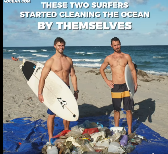
This thumbnail deserves a 5 out of 5 because it tells a complete story in a single frame. The image of two surfers standing on a sunny beach beside a huge pile of collected trash instantly communicates the mission and grabs attention through strong emotional contrast. It’s visually striking, authentic, and packed with curiosity—viewers immediately want to know why they’re doing this and how it started. The clear text overlay reinforces the narrative and frames the surfers as everyday heroes, which boosts relatability and intrigue. Bright natural lighting, human faces, and a purpose-driven storyline all work in its favour.
2. Hook Score:
I give the hook a 4 out of 5. The hook in this ad is powerful because it opens with a compelling, story-driven line: “These two surfers started cleaning the ocean by themselves.” This instantly triggers curiosity — viewers want to know who they are, why they started, and what happened next. The phrasing makes the action feel brave, grassroots, and urgent, which is perfect for cause-driven storytelling. It also creates an emotional pull by highlighting individual initiative against a global problem, making the viewer feel both inspired and guilty enough to keep watching. The only reason it doesn’t get a perfect 5 is because it relies heavily on text rather than voiceover. A voiceover can keep users engaged for longer since they do not have to put in the extra effort of reading. But for its target audience, it’s nearly flawless.
3. Retention Score:
I give the retention score a 4.5 out of 5. The ad maintains attention well because the story feels real, visual, and purposeful. Viewers naturally stick around to see what the surfers achieved and how the initiative grew. The pacing is clean, and the visuals are strong enough to hold interest. However, retention dips slightly because most scenes stay visually similar — more variation or behind-the-scenes action could increase watch-through rates.
4. Click Score:

I’d give this caption a click score of 3.5 out of 5. The question, “Could this be the solution to ocean pollution?” creates an immediate curiosity gap and taps into a universally understood problem, which naturally encourages people to click to learn more. It opens a strong emotional and informational loop. However, the follow-up CTA — “Go to 4ocean.com” — is functional but not persuasive. It lacks urgency, emotional pull, or a clear benefit for clicking right now. There’s no hint of what the viewer will gain or discover on the other side of the link, which limits its effectiveness. Overall, the caption has a solid curiosity-driven start but misses the final nudge needed to maximise clicks.
5. Ugly Score:
I give it an ugly score of 5 out of 5. This is peak UGC energy, and it works. Raw beach shots, real people, zero glossy production — it feels like something someone captured because they care, not because they’re selling. In cause-based marketing, authenticity is everything. The “ugly” look gives it credibility and honesty, making viewers far more likely to trust the story.
6. Congruency Score:
I give congruency a full 5 out of 5. The landing page is highly congruent with the ad because it immediately reinforces the same mission-driven message: every purchase helps remove ocean plastic. It delivers strong social proof with thousands of positive reviews and clear impact metrics, which builds trust and aligns with the story shown in the ad. However, while the message and visuals are consistent, the page lacks urgency—there are no limited-time offers, countdowns, or scarcity cues to push users to act now. Overall, the landing page aligns well with the ad’s promise, but adding stronger urgency would significantly improve conversion potential.
How Can You Use This For Your Business:
Here’s what you can borrow from this ad:
1. Lead with a human story, not a product: People connect to people — not objects. If you’re selling a service, program, or idea, start with a real human narrative that embodies your mission.
2. Use “authentic ugly” visuals intentionally: Low-production, real-world footage builds trust far faster than polished corporate ads. Especially in advocacy, social issues, youth work, or training programs — authenticity beats aesthetics.
3. Make the problem visually obvious: This ad uses the shocking contrast of beauty vs. waste. Think:
Before/after moments
A broken system vs. the solution you offer
Real struggles vs. transformation
4. Turn the viewer into part of the mission: Cause-driven ads convert best when people feel they’re joining something bigger. Frame your CTA as an invitation to contribute, not a transaction.
5. Keep messaging simple and emotionally charged: Short lines. Strong visuals. Clear mission. No fluff.
6. Build narrative curiosity: Use hooks like:
“It started with one small decision…”
“This almost didn’t happen…”
“The truth shocked us…”
When people crave the next part of a story, their retention and clicks increase automatically.
Check out the Landing Page:
Here’s the landing page for this product:
https://www.4ocean.com/pages/shop-page-x-4ocean
This email is packed with insights; I again recommend saving these in your Gmail for future reference.
Well, that’s all for the newsletter, folks!
Finally, I would like to add that I will continue sending you these ads every Monday, but they alone may not be sufficient for your success, as you would want more concepts under your belt.
Therefore, if you are a Facebook ads marketer and want more ads like these for yourself, then go ahead and check out Minea.
Here is the promo code offering you 20% off for 3 months: SANNIDHYA20
And here is my affiliate link: [https://app.minea.com/find-winning-product?ref=k63dd]
Also, let me know which niche’s ad I should pick up next for you. I would love to hear from you.