Hey,
Welcome to the 86th edition of Ad Pulse Monday!
For those new to this series, every Monday, I select an ad or ads that have performed exceptionally well. I’ll break down their success factors, key takeaways, and how you can apply these insights to your business.
If you’re already familiar with Ad Pulse Monday, welcome back!
Consider adding a label to these emails for easy access, just like Shailendra did, creating a handy repository right in your inbox.
Without further ado, let’s dive in!
To view the ad, register on Minea using this affiliate link (and get a flat 20% discount on paid plans):
https://app.minea.com/ads/facebook?ref=k63dd
Then, you can click on this link:
https://app.minea.com/en/ads/meta-library/lib_855949850329485/details
1. Thumbnail Score:
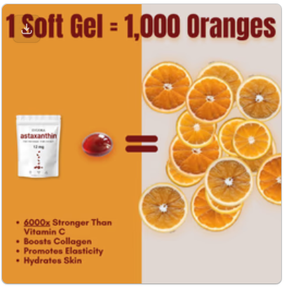
I would give a thumbnail score of 4 out of 5. The thumbnail immediately grabs attention with a bold orange background split into two sections. The left side features large red text: “1 soft Gel = 1,000 Oranges” with bullet points listing benefits. The right side displays fresh orange slices arranged in a grid pattern, with two red softgel capsules at the bottom.
What works:
- The “1 = 1,000” comparison creates instant intrigue and demonstrates potency
- Orange color psychology perfectly matches the product (antioxidants, vitamin C association)
- Strong visual contrast between the bold orange background and white product packaging
- The actual orange slices reinforce the natural ingredient story
- Bullet points are scannable: “6000x Stronger Than Vitamin C,” “Boosts Collagen,” “Promotes Elasticity,” “Hydrates Skin”
- Product packaging is clearly visible in the bottom left
But they could have added one of these things to get a perfect 5. A tiny bit more real life mess. A texture moment that feels less designed. A touch of visual imperfection that says this is something people actually use. The creative leans very polished right now. Introducing just a bit more ugliness here would make it feel more believable and therefore more convincing. It also misses a human element – no transformation and no testimonial.
However, the comparison to 1,000 oranges is powerful pattern interruption that makes you think, “Wait, what? How is that possible?” That curiosity alone drives engagement.
2. Click Score:
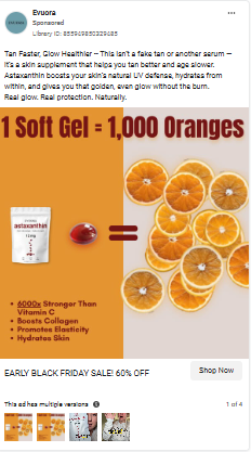
I’d give a click score of 3 out of 5.
The visual instantly communicates potency and that creates curiosity, but the surrounding elements could push harder on why someone should click.
Also, here are the caption, headline and description below as the screenshot is a bit blurry.
Caption
“Tan Faster, Glow Healthier — This is not a fake tan or another serum, it is a skin supplement that helps you tan better and age slower…”
There is a strong emotional angle here — a better tan and anti aging protection — but it gets long and scientific too quickly. Shorter, punchier claims would hit harder.
Headline
“EARLY BLACK FRIDAY SALE! 60% OFF”
Seasonal urgency works well. It signals savings right away. A win.
Description
Not much persuasion happening here. It mostly describes the product category instead of why a shopper should buy today. The sale is mentioned, but no clear value comparison or transformation promise.
Thumbnail
The “1 Soft Gel = 1,000 Oranges” message is the hero. It is a strong pattern interrupt with a huge perceived benefit. Great color contrast, bold typography, and natural ingredient cues all support quick comprehension. Still, no human element or visual proof of glowing skin makes it feel slightly too product centric.
Overall, the ad does a good job grabbing attention, but the click motivation needs one more strong push focused on visible skin improvement or real world benefits.
3. Ugly Score:
I’d give an ugly score of 2 out of 5.
This ad leans toward the polished side but has some “ugly” elements that work in its favor.
What’s working:
- The bold, almost aggressive orange background feels less corporate
- The comparison text is large and in-your-face
- It’s not a perfect studio shot—there’s personality
What’s too polished:
- The product packaging looks professionally photographed
- The orange slices are too perfectly arranged
- No real person, no testimonial, no transformation story
- Feels like an infographic rather than a genuine recommendation
How to make it uglier and more effective:
Imagine this instead: A quick snap at a supermarket checkout. A hand holding the bottle next to a pile of oranges. Bright grocery store lighting, messy cart in the background. Caption on the image: “Why buy 50 oranges when one capsule does the job?.
The comparison to 1,000 oranges is great educational content, but pair it with real human results. That’s the winning formula.
For supplements, people need to see themselves in the ad. They need proof that real people, not just lab studies, got results.
4. Congruency Score:
I will give this ad a congruency score of 4 out of 5.
The landing page maintains strong consistency with the ad creative.
What works on the landing page:
- Clear headline: “Get a radiant, even tan—powered by natural antioxidants”
- Social proof front and center: “Excellent 4.7 Stars! | 4,000+ Customers”
- Urgency message: “You Asked, We Restocked (Again). Limited Supply!”
- Ships in 48 hours notification
- Detailed benefit breakdown matches ad claims
- Multiple product images
- Customer testimonials with photos (Tracy, Amanda, Marina)
- Addresses key objections with Q&A section
What could be improved:
- The price isn’t immediately visible—you have to scroll
- Black Friday discount should be more prominent above the fold
- Could use more video testimonials for higher conversion
- More dramatic before/after imagery
- The scientific explanation is good but could be simplified
The page does an excellent job of expanding on the ad’s promise. The “1 soft gel = 1,000 oranges” claim from the ad is reinforced with explanations about antioxidant power. The congruency is solid.
How Can You Use This For Your Business?
1. Use powerful comparison metrics
The “1 = 1,000” comparison is brilliant because it:
- Makes an abstract benefit (antioxidants) concrete
- Creates immediate curiosity
- Positions the product as concentrated and powerful
- Justifies the price point
Apply this to your business:
- Skincare: “1 serum = 10 spa treatments”
- Protein powder: “1 scoop = 6 chicken breasts”
- Productivity app: “Save 15 hours per week”
- Course: “Learn in 6 weeks what took me 6 years”
Don’t just say “powerful” or “effective”—quantify it in a way people can visualize.
2. Leverage seasonal urgency correctly
Black Friday isn’t just about discounts—it’s about culturally accepted buying behavior. People expect to shop and spend during this period.
Elements to include:
- Clear time limit (“Sale ends Monday”)
- Stock scarcity (“Only 147 units left”)
- Exclusive offer (“Black Friday exclusive bundle”)
- Urgency visual cues (countdown timer, lightning bolt emoji)
But don’t fake it. Real urgency converts. Fake urgency destroys trust.
3. Bridge the gap between science and emotion
This ad does something smart: it leads with an emotional benefit (radiant skin, better tan) but backs it with science (antioxidants, Icelandic microalgae).
The formula:
- Hook with emotion: “Get glowing skin”
- Support with science: “6000x stronger antioxidants”
- Prove with social proof: “4,000+ happy customers”
- Close with guarantee: “90-day money-back”
Most supplement brands make one of two mistakes:
- Too scientific (boring, confusing)
- Too emotional (untrustworthy, snake oil)
The best ads do both. Lead with the transformation, prove it with science.
4. Address the skepticism head-on
The landing page Q&A section is smart. It addresses common objections:
- “How does it actually work?”
- “What makes this different?”
- “When will I see results?”
Bring this into your ads:
- “Skeptical? We were too. Then we saw the results.”
- “Not another miracle pill. Here’s the actual science.”
- “Real results in 1-3 weeks (and we can prove it)”
Acknowledging doubt makes you more trustworthy. It shows you understand their hesitation and have answers.
5. Add the human element
This ad’s biggest weakness is the lack of real people and transformation stories. The landing page has testimonials, but they should be in the ad too.
What to test:
- Video testimonials from actual customers
- Before/after photos (with permission)
- iPhone-quality footage of someone taking the supplement daily
- Real skin transformation over 30 days
Quick UGC collection strategy:
- Offer a free month supply for video testimonials
- Run a “30-day transformation challenge”
- Feature customer stories on social media
- Incentivize with discounts for sharing results
Raw transformation content will outperform this polished creative by 2-3x.
Check out their Landing Page:
Here’s the landing page for this product:
https://shopevuora.com/products/premium-astaxanthin-antioxidant-softgels%E2%84%A2-1
This post is packed with insights; I again recommend bookmarking it in your browser for future reference.
Well, that’s all for the newsletter, folks!
Finally, I would like to add that I will continue sending you these ads every Monday, but they alone may not be sufficient for your success as you would want more concepts under your belt.
Therefore, if you are a Facebook ads marketer and want more ads like these for yourself, then go ahead and check out Minea.
Here is the promo code offering you 20% off for 3 months: SANNIDHYA20
And here is my affiliate link: [https://app.minea.com/find-winning-product?ref=k63dd]
Also, let me know which niche’s ad I should pick up next for you. I would love to hear from you.