Hey,
Welcome to the 85th edition of Ad Pulse Monday!
For those new to this series, every Monday, I select an ad or ads that have performed exceptionally well. I’ll break down their success factors, key takeaways, and how you can apply these insights to your business.
If you’re already familiar with Ad Pulse Monday, welcome back!
Consider adding a label to these emails for easy access, just like Shailendra did, creating a handy repository right in your inbox.
Without further ado, let’s dive in!
To view the ad, register on Minea using this affiliate link (and get a flat 20% discount on paid plans):
https://app.minea.com/ads/facebook?ref=k63dd
Then, you can click on this link:
https://app.minea.com/en/ads/meta-library/lib_865829629125394/details
1. Thumbnail Score:
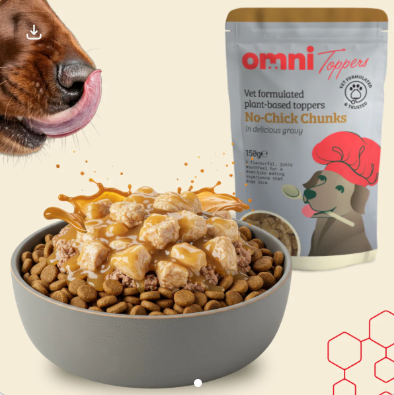
I give the thumbnail a score of 3 out of 5. shows a dog food scenario: bowl of kibble with chunky toppers + sauce drizzle, and a close-up of a dog’s face licking lips. The Omni product packaging is visible in the background. It tries to create a pattern interruption with the dog face and food splash, but it doesn’t fully land because the overall image still feels polished and stock-like
What works is that the food splash creates visual interest and suggests “flavor explosion,” and the product is prominently displayed with clear branding. The gray bowl on a neutral background keeps focus on the food. And the ad shows the actual product application (toppers on kibble).
However, the image is too polished and “stock photo-ish”. There’s no pattern interruption that makes you stop mid-scroll. The molecular structure graphics in the corner add nothing and create visual clutter. There’s no big bold headline or overlay text that says “Plant-Powered,” or “Allergy-Friendly,” or “For picky pups” at first glance. Adding a short message overlay (“Plant-Powered Topper”, “Dog refused Kibble? Try This”) could bump it to 5.
The thumbnail looks professional but lacks the emotional hook that would make a pet parent stop scrolling. Where’s the happy, drooling pup? Where’s the transformation story? It feels like a product catalogue shot rather than an ad that connects with the viewer’s love for their furry friend.
2. Click Score:
I’d give a click score of 2.5 out of 5.
Let’s break down the caption and CTA elements:
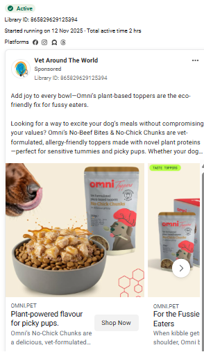
The Caption: “Add joy to every bowl—Omni’s plant-based toppers are the eco-friendly fix”
This is decent but generic. “Add joy to every bowl” is nice but doesn’t hit a specific pain point. What problem does this solve? Is their dog a picky eater? Is the kibble boring? Are they concerned about sustainability?
The CTA: “Shop Now” button is present, which is better than nothing, but it’s weak.
What’s missing:
- No urgency or FOMO (no limited time offer, no scarcity)
- No social proof (no “Join 10,000+ happy pet parents”)
- No risk reversal (no money-back guarantee mentioned)
- No specific benefit called out (“Ends mealtime battles” or “Even the pickiest pups devour this”)
- No price anchor or deal mentioned
The “eco-friendly” angle is good for a specific audience, but it’s not the primary pain point for most pet parents. In the first image, they want their dog to actually eat the food and be healthy. The environmental benefit is secondary.
The first image shows the product + promise.
It shows 3 product packages clearly, however, the headline is generic (“Add joy to every bowl”) and doesn’t lead with the strongest hook
Missed opportunity: Should open with the biggest pain point or most compelling benefit
The second image shows features + food Porn
It has a strong visual of appetizing dog food. Benefit callouts are good: “HIGH IN PROTEIN,” “COMPLEMENTARY FOOD,” “FUSSY DOG APPROVED”
Problem: Too text-heavy with circular badges that compete for attention
The food looks great, but the layout is cluttered
The third image shows the product in context
It has a beautiful styling with the bowl of food. It shows the product in use
Weakness: No clear caption or benefit stated – just relies on visual appeal
Missing a hook like “Before: Boring kibble. After: This.”
The fourth image has that social proof
This is the strongest slide – real customer testimonial with 5 stars. It has an authentic quote about picky eating (“lines up at the cupboard now”) and includes the customer’s name (JONI L.)
Issue: The caption below is cut off and unclear (“Because mealtimes shouldn’t be a battle”)
The fifth image has that lifestyle shot
It shows dogs with product packages and shows trust/credibility (“Trusted by UK Pet Parents”)
Weak point: Generic caption again, no specific outcome promised
A stronger approach would be:
- “Finally, a topper that even the pickiest pups can’t resist 🐕”
- “Turn boring kibble into your dog’s favorite meal”
- “Limited stock: Join 15,000+ pet parents who solved mealtime stress”
3. Ugly Score:
I will give this ad an ugly score of 1 out of 5. This ad is way too polished — it feels like a studio photoshoot, not something a real pet parent would trust.
Pet parents don’t believe perfect product shots. They believe other pet parents. They want to see:
- A real dog going crazy for the food
- A messy kitchen counter, not a staged set
- A picky eater who suddenly cleans the bowl
- A quick iPhone clip showing genuine excitement
What would make this “uglier” and way more effective:
The carousel should focus on authenticity. Start with a hungry dog staring down the bowl, then show a close up of the food with real texture, follow with a half eaten bowl captioned “She never finishes. Until today”, and end with the product on a normal counter with a simple line like “Omni toppers. Clean bowls every time.” Real photos build real belief.
The Ugly Pet-Product Formula:
- Real pets
- Real homes
- Real reactions
- iPhone quality
UGC > Studio. Every time.
4. Congruency Score:
I will give a congruency score of 3.5 out of 5. The landing page maintains consistent branding with the ad—same product imagery, similar color palette, and clean design aesthetic.
What works on the landing page:
- Product description is clear
- Shows the product packaging consistently
- Maintains the plant-based, eco-friendly messaging
- Clean, professional layout
What could be improved:
- The page doesn’t immediately address the core pain point (picky eaters, boring kibble)
- Could use more social proof above the fold (testimonials, reviews, number of happy customers)
- The transformation element is missing—show me a before/after scenario
- No urgency or FOMO elements
- Could benefit from a video showing a dog actually eating and enjoying the product
The page feels informative but not persuasive. It tells me about the product but doesn’t make me feel like I need to buy it RIGHT NOW for my furry friend.
How Can You Use This For Your Business?
1. Lead with the emotional outcome, not the product feature
Pet parents don’t buy dog food toppers. They buy:
- Peace of mind that their dog is eating well
- The joy of seeing their pup excited for mealtime
- Relief from the stress of a picky eater
- The feeling of being a good pet parent
Instead of “Add joy to every bowl,” test:
- “My picky rescue finally cleans her bowl every time”
- “From food refuser to bowl licker in 3 days”
- “I cried when she actually ate her dinner”
The emotional story beats the functional benefit every single time.
2. Show real dogs, real reactions, real results
Get your actual customers to film their dogs:
- The moment they put the bowl down
- The dog’s reaction when they smell it
- The empty, licked-clean bowl afterward
- The pet parent’s surprised/happy face
Create a UGC campaign:
- Offer a free bag in exchange for video testimonials
- Run a contest for “best transformation video”
- Feature real customer stories with their permission
- Show dogs of different breeds, sizes, and eating challenges
Raw UGC will outperform this polished creative by 3-5x. Your engagement rate will skyrocket.
3. Address the real pain points directly
Most pet parents trying toppers have one of these problems:
- Picky eater who turns their nose up at regular kibble
- Older dog with decreased appetite
- Dog on bland prescription diet that needs flavor
- Want to add nutrition without switching entire food
- Concerned about sustainability but dog won’t eat plant-based
Test headlines that call these out:
- “For the dog who acts like their kibble is poison”
- “Senior pups need flavor too”
- “Vet-approved kibble tastes like cardboard. We fixed that.”
- “Plant-based protein your dog will actually devour”
Don’t be subtle. Call out the specific scenario your ideal customer is facing.
4. Create urgency and remove risk
- “Limited batch: Only 247 bags left”
- “First-time customer: 30% off your first order”
- “Subscribe and save 25% (cancel anytime)”
- “Join the waitlist—next batch ships December 1”
Urgency tactics to test:
Risk reversal:
- “100% money-back guarantee if your picky pup doesn’t lick the bowl”
- “Try it risk-free for 30 days”
- “Your dog will love it, or we’ll refund every penny”
Give people a reason to click NOW and remove the fear of wasting money on something their dog might reject.
5. Leverage the plant-based angle strategically
The eco-friendly, plant-based positioning is great for a specific audience, but it should be framed around the dog’s health AND the planet:
Instead of: “Eco-friendly fix” Try: “Planet-friendly protein that’s easier on sensitive stomachs”
Benefits to highlight:
- Easier to digest than meat proteins
- Hypoallergenic for dogs with food sensitivities
- Complete nutrition without the environmental impact
- Recommended by vets for dogs with allergies
The sustainability angle attracts conscious consumers, but the health benefits sell the product.
Check out their Landing Page:
Here’s the landing page for this product: https://omni.pet/products/omni-toppers-no-beef-bites-no-chick-chunks?ref=PLANTPOWEREDPUP
This post is packed with insights; I again recommend bookmarking it in your browser for future reference.
Well, that’s all for the newsletter, folks!
Finally, I would like to add that I will continue sending you these ads every Monday, but they alone may not be sufficient for your success as you would want more concepts under your belt.
Therefore, if you are a Facebook ads marketer and want more ads like these for yourself, then go ahead and check out Minea.
Here is the promo code offering you 20% off for 3 months: SANNIDHYA20
And here is my affiliate link: [https://app.minea.com/find-winning-product?ref=k63dd]
Also, let me know which niche’s ad I should pick up next for you. I would love to hear from you.