Hey,
Welcome to the 75th edition of Ad Pulse Monday!
For those new to this series, every Monday, I select an ad or ads that I believe have performed exceptionally well. I’ll break down their success factors, key takeaways, and how you can apply these insights to your business.
If you’re already familiar with Ad Pulse Monday, welcome back!
Consider bookmarking these posts, creating a handy repository right in your browser.
Without further ado, let’s dive in
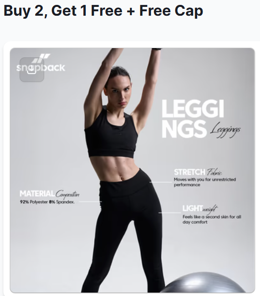
Buy 2, Get 1 Free + Free Cap
To view the ad, register on Minea using this affiliate link (and get a flat 20% discount on paid plans):
https://app.minea.com/ads/facebook?ref=k63dd
And then click on this link:
https://app.minea.com/en/ads/meta-library/lib_3228977257278454/details
1. Thumbnail score:
I give the thumbnail a 2 out of 5. The brand is clearly showing what their product looks like when worn. However, it would’ve made more sense to show the product in action.
A demonstration of how it looks on the body for clothing websites is a game-changer. Also, showing the leggings in a lifestyle context, like gym, yoga, and everyday workouts, can help convert this ad into a scroll-stopping one. Currently, this looks cold and brochure-like with no visual or emotional appeal to the viewer.
Also, short user-generated videos can do wonders for clothing brands as opposed to static images. However, in case of static images, it helps to build your case by providing relevant content by setting up the background.
2. Click Score:
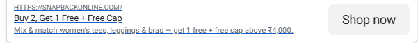
For the click score, I give a 2 out of 5 since even though they use the “3 for 2” offer deal, there is no sense of urgency, nor is it attention-grabbing.
Viewers might be more likely to scroll past the ad. Something like a limited-time deal might have pushed them more.
There is no visual representation of the offer in question.
There is no cap, nor are there leggings displayed as an offer.
Overall, the caption fails to connect with the user in a way that will drive them to click.
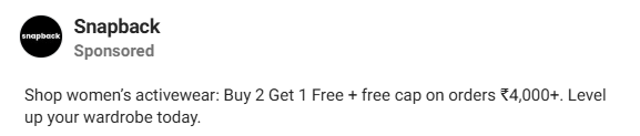
The Caption Analysis: The copy feels like a generic product description rather than compelling ad copy. It lacks any emotional hook or curiosity gap that would make someone stop scrolling. There’s no personality, no story, and no reason for the audience to care beyond the basic offer.
The Headline Breakdown: “Buy 2 Get 1 Free + Free Cap” is technically clear but creatively dead. It’s missing urgency markers, emotional triggers, or any sense of exclusivity. Compare this to something like “⚡ Flash Sale: Your 3rd Cap is FREE (48 Hours Only)” – see the difference?
The Offer Presentation: While the “3 for 2” deal has potential, it’s presented without any visual reinforcement or urgency. There’s no countdown, no “limited stock” warning, no social proof – nothing that creates FOMO or pushes immediate action.
The Holistic Impact: When you combine the bland caption + weak headline + invisible urgency + missing visuals, you get an ad that blends into the Facebook feed like wallpaper. The individual elements aren’t terrible, but together they create something completely forgettable.
The Real Issue: This ad is trying to inform rather than persuade. It tells people about an offer but doesn’t make them WANT to click.
Your Fix-It Checklist: ✅ Caption: Start with a hook that stops the scroll
✅ Headline: Add urgency and emotional appeal
✅ Visuals: Show the offer (3 caps with one marked “FREE”)
✅ Overall: Make it feel like they’ll miss out if they don’t click NOW
Bottom Line: Good offer, terrible execution. The sum is definitely less than its parts here.
3. Ugly Score:
I give an ugly score of 2 out of 5 since the ad looks like a basic ad creative and not “ugly” enough.
Again, UGC can do wonders here instead of using a basic catalogue-style creative.
There is no appeal to the user that will make them click on the ad or stop their scroll.
4. Congruency Score:
For congruency, I would give it a 3.5 on 5 since the landing page opens directly to the product.
But also shows a range of different products on the landing page.
This might be advantageous to the business since the audience now has a choice among a variety of options, but since it shows a variety of options on the landing page itself, it might create a paradox of choice that might stop them from taking any meaningful action.
How can you use this for your business?
- Make sure to be inclusive of different customer personas when targeting your audience. It’s a great way to engage and convert.
- Ditch the overly polished look for something more raw. This will make your ad stand out as more genuine and less ‘sales-y.’
- Never underestimate the power of your words in the caption. It should complement your video/ image by reinforcing the message and directing viewers to their next steps.
- Trust User-generated content for your creatives. UGCs appeal more to the viewers as they are more likely to trust everyday folks than the brand itself.
- Make users feel like they’re missing out on something by creating a sense of urgency.
- Use hooks that will stop the scroll and make someone want to click on your ad.
Check Out the Landing Page:
Here’s the landing page for this product:
https://snapbackonline.com/collections/women
This post is packed with insights; I again recommend bookmarking it in your browser for future reference.
Finally, I would like to add that I will continue sending you these ads every Monday, but they alone may not be sufficient for your success as you would want more concepts under your belt.
Well, that’s all for post, folks!
Therefore, if you are a Facebook ads marketer and want more ads like these for yourself, then go ahead and check out Minea.
Here is the promo code offering you 20% off for 3 months: SANNIDHYA20
And here is my affiliate link: [https://app.minea.com/find-winning-product?ref=k63dd]
Also, let me know which niche’s ad I should pick up next for you. I would love to hear from you.
DISCLAIMER: This post contains affiliate links, which means that if you click on one of the product links, I’ll receive a small commission.