Hey,
Welcome to the 69th edition of Ad Pulse Monday!
For those new to this series, every Monday, I select an ad or ads that I believe have performed exceptionally well. I’ll break down their success factors, key takeaways, and how you can apply these insights to your business.
If you’re already familiar with Ad Pulse Monday, welcome back!
Consider bookmarking these posts, creating a handy repository right in your browser.
Without further ado, let’s dive in
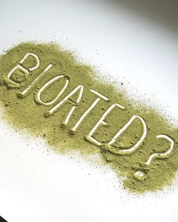
Gut Superfood
To view the ad, register on Minea using this affiliate link (and get a flat 20% discount on paid plans):
https://app.minea.com/ads/facebook?ref=k63dd
And then click on this link:
https://app.minea.com/en/ads/facebook/748328310642791/details?ref=k63dd
1. Thumbnail score:
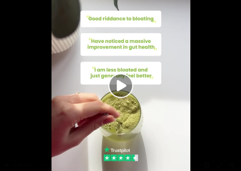
I’m giving this a solid 4 out of 5.
The thumbnail uses real customer reviews to draw you in, which is a smart way to build instant trust.
Including the Trustpilot rating further strengthens the credibility. I also love that the reviews don’t look polished – they use Meta-native fonts and formatting, which gives the whole thing an authentic feel.
That said, I would’ve preferred they zoomed in on just one strong review and made the text bigger. That would’ve helped with visibility and improved thumbstop ratio. Still, the quality of reviews used is solid.
They feel human, highlight pain points, and address objections. Pair that with the visual of the supplement being mixed, and you’ve got a scroll-stopping thumbnail.
2. Click Score:
This gets a 5 out of 5.
The ad opens with a question asked by the product itself.
That’s just brilliant storytelling.
It instantly builds curiosity, and you want to know more.
The pacing is tight, the jump cuts work well, and you’re pulled into the story from second one. It’s the kind of hook that doesn’t let you scroll away.
3. Retention Score:
A solid 5 out of 5 here.
The ad is just 14 seconds long, but it’s packed with movement, transitions, and layers of messaging.
In that short span, it sets up a relatable problem, introduces the product as the solution, shows off benefits, addresses objections, and builds FOMO with its customer base.
There’s a lot happening, and that’s exactly why people will rewatch it. The upbeat music keeps the vibe light and energetic.
4. Click Score:
This gets a 4 out of 5 from me.
The ad keeps you engaged till the end and then transitions smoothly into the offer.
The headline supports the narrative well, and the description throws in social proof that creates a sense of urgency.
Could it have been a bit sharper? Yes. Maybe a CTA that nudges action more strongly. But overall, this setup is built to get clicks.

5. Ugly score
This is a 5 out of 5. Everything about this ad screams “authentic.”
The design feels native to Meta, the cuts are raw, and the shots don’t feel overly polished.
That’s what makes it relatable. People trust content that feels organic, and this ad leans into that perfectly.
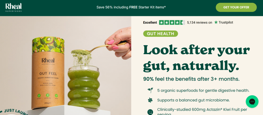
6. Congruency Score:
Another solid 5 out of 5. When you click on the ad, you land exactly where you expected to go.
The same offer, same messaging, and same tone are carried over to the landing page.
That alignment makes the experience frictionless.
The layout is clean, the copy is on point, and you’ve got customer reviews and CTAs in all the right places.
Caption:
This caption is on point. It’s well-structured with paragraph breaks and emojis that make it easy to read.
It also spotlights the product benefits and ends with a strong CTA, tying everything together nicely.
How can you use this for your business?
1. Try kicking off your ad with a product-led question. It instantly builds curiosity and positions your product as a solution.
2. Use native Meta elements – polls, overlays, sticker-style fonts – to make your ad feel like content, not an ad.
3. Don’t be afraid of “busy” visuals. If you’ve got multiple angles to pitch (benefits, reviews, FOMO, proof), layer them cleverly into a short, punchy edit.
Check Out the Landing Page:
Here’s the landing page for this product:
https://rhealsuperfoods.com/pages/gut-feel/
This post is packed with insights; I again recommend bookmarking it in your browser for future reference.
Finally, I would like to add that I will continue sending you these ads every Monday, but they alone may not be sufficient for your success as you would want more concepts under your belt.
Well, that’s all for post, folks!
Therefore, if you are a Facebook ads marketer and want more ads like these for yourself, then go ahead and check out Minea.
Here is the promo code offering you 20% off for 3 months: SANNIDHYA20
And here is my affiliate link: [https://app.minea.com/find-winning-product?ref=k63dd]
Also, let me know which niche’s ad I should pick up next for you. I would love to hear from you.
DISCLAIMER: This post contains affiliate links, which means that if you click on one of the product links, I’ll receive a small commission.