Hey,
Welcome to the 67th edition of Ad Pulse Monday!
For those new to this series, every Monday, I select an ad or ads that I believe have performed exceptionally well. I’ll break down their success factors, key takeaways, and how you can apply these insights to your business.
If you’re already familiar with Ad Pulse Monday, welcome back!
Consider bookmarking these posts, creating a handy repository right in your browser.
Without further ado, let’s dive in
Washington Drivers
To view the ad, register on Minea using this affiliate link (and get a flat 20% discount on paid plans):
https://app.minea.com/ads/facebook?ref=k63dd
And then click on this link:
https://app.minea.com/en/ads/facebook/725107242982860/details?ref=k63dd
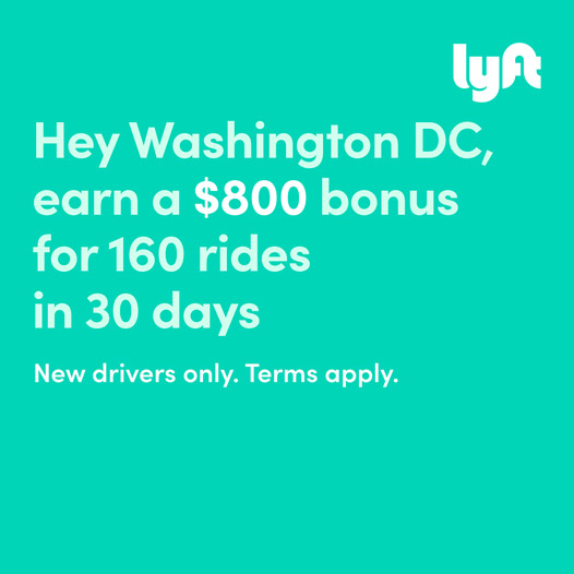
1. Thumbnail score:
I’m giving this a solid 4 out of 5.
Text-only ads are crushing it on Meta right now, and it’s not hard to see why.
They break through the visual noise, hook you with simplicity, and make the messaging do all the heavy lifting.
This ad is a great example of how powerful words can be when used right. It focuses on one core idea: show the exact benefit, call out the target location (Washington), and give a hard number to add credibility.
That’s it. No flashy visuals, no fluff – just message clarity. If you’re trying to talk to a niche audience, this is how you do it. Strip it down. Speak directly. Make it about them.
My only problem? The headline could have made it way stronger. A punchy hook at the top would’ve taken this from great to scroll-stopping. But even without it, the clarity of the offer and the qualification of who it’s meant for makes this ad stand out.
Bonus points for including the Trustpilot rating right in the creative. That single badge can instantly boost credibility and improve purchase intent.
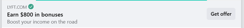
2. Click Score:
This one gets a 4 out of 5.
Even without a strong CTA button, the creative itself builds up the offer really well.
The description reinforces the message and adds context, and the use of a specific number gives it more weight.
Whenever you can quantify the benefit, people are more likely to pause and click. So while it’s not the most emotionally charged ad, it works because of how clear and specific it is.
3. Ugly Score:
A full 5 out of 5.
This is exactly what an “ugly ad” should look like – no design polish, no distractions, just message-first advertising.
And that’s what works best right now. It looks like a post your friend could’ve shared, not a polished brand trying to sell you something. That’s why it cuts through the noise.
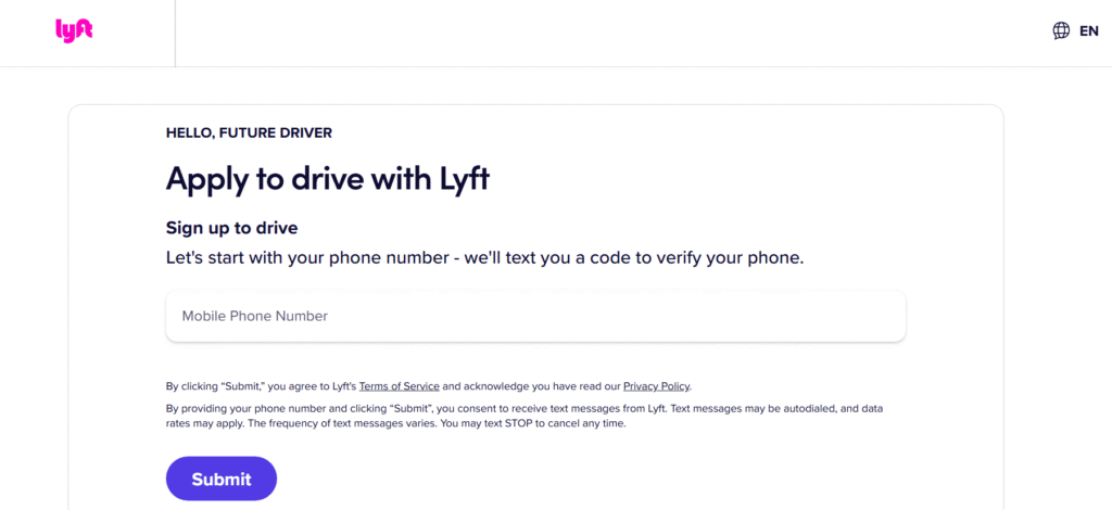
4. Congruency Score:
This gets a 3.5 out of 5.
When you click through, you land on a lead form asking for your phone number right away.
Now, the flow isn’t necessarily broken, but here’s the problem – there was no mention of that in the ad. If people come in expecting to learn more or get a downloadable guide and are hit with a form, it can feel jarring.
Just a simple line in the caption like “Enter your number to check if you qualify” would’ve smoothed this over.
Caption:
The caption is sadly a missed opportunity.
Major missed opportunity. One line is not going to cut it, especially for an ad that requires people to give you something (like a phone number). You’ve already done the hard work with the creative – why not carry that clarity into the caption?
A good caption could’ve easily added a sense of urgency, reinforced the benefit, and handled the objection around sharing personal info.
How can you use this for your business?
1. If you’re running localized campaigns or targeting niche audiences, test text-only creatives. Strip back the visuals and let your messaging do the work.
2. Speak directly to your audience. Use city names, job roles, or specific traits. Make it feel personal.
3. Quantify your benefits. Numbers – when real and relevant – make people pause.
Check Out the Landing Page:
Here’s the landing page for this product:
https://www.lyft.com/drive-with-lyft?ref=DCA80016030ABCDP®ion=DCA
This post is packed with insights; I again recommend bookmarking it in your browser for future reference.
Finally, I would like to add that I will continue sending you these ads every Monday, but they alone may not be sufficient for your success as you would want more concepts under your belt.
Well, that’s all for post, folks!
Therefore, if you are a Facebook ads marketer and want more ads like these for yourself, then go ahead and check out Minea.
Here is the promo code offering you 20% off for 3 months: SANNIDHYA20
And here is my affiliate link: [https://app.minea.com/find-winning-product?ref=k63dd]
Also, let me know which niche’s ad I should pick up next for you. I would love to hear from you.
DISCLAIMER: This post contains affiliate links, which means that if you click on one of the product links, I’ll receive a small commission.