Hey,
Welcome to the 45th edition of Ad Pulse Monday!
For those new to this series, every Monday, I select an ad or ads that I believe have performed exceptionally well. I’ll break down their success factors, key takeaways, and how you can apply these insights to your business.
If you’re already familiar with Ad Pulse Monday, welcome back!
Consider bookmarking these posts, creating a handy repository right in your browser.
Without further ado, let’s dive in
Competition Alert

To view the ad, register on Minea using this affiliate link (and get a flat 20% discount on paid plans):
https://app.minea.com/ads/facebook?ref=k63dd
And then click on this link:
https://app.minea.com/en/ads/facebook/2908174465982970/details?ref=k63dd
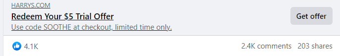
1. Thumbnail score:
I’m giving this a solid 5 out of 5. There’s a common misconception that Us vs. Them ads violate Meta ad policies, but they don’t.
In fact, this classic format is a proven winner for driving conversions. This ad executes the Us vs. Them strategy brilliantly by putting the competition to the test with clear facts.
It highlights the price USP of their product without dragging the competitor down—just enough to get the message across.
The comparison chart smartly showcases the product’s features while serving multiple purposes, making it highly effective.
The best part? The ad doesn’t scream “advertisement,” and the headline is attention-grabbing. I’m confident this ad has a low CPM and effectively stops the scroll.
2. Hook Score:
This gets a 4.5 out of 5 from me.
The creative does an excellent job of highlighting the offer and grabbing attention. Using an unconventional checklist format makes it stand out even more.
The headline includes a promotional offer, which is a smart move to increase the CTR. Freebies and discounts always reduce customer friction and motivate users to click.
Plus, the ad has been running for a while, collecting solid social proof, which adds to its effectiveness.
3. Ugly Score:
When done right, the Us vs. Them format can be a total game-changer.
This ad avoids flashy branding and directly addresses customer pain points. It doesn’t feel overly salesy but speaks to the audience in a straightforward way.
The design looks more like an infographic, which works in its favor by giving it a fresh and authentic vibe.
4. Congruency Score:
This ad gets a perfect 5 out of 5.
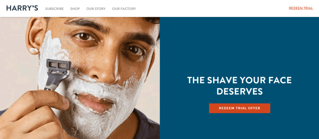
Clicking through takes you to a landing page where the exact same offer from the ad is showcased, reinforcing the decision to click.
The page is clean, easy to navigate, and well-organized, with CTAs, customer testimonials, and related product catalogs in all the right places.
Caption:
The caption gets a 5 out of 5. It’s short, clear, and well-structured, effectively explaining the offer with paragraph breaks and emojis to make it easy to read.
It also ends with a strong CTA that encourages users to click the “buy now” button.
How can you use this for your business?
- If your product has a clear competitive edge—be it price, features, or benefits—don’t shy away from showing it. Use a comparison chart to highlight the advantages your product offers without directly attacking the competition.
- Use design elements like checklists, charts, or tables to break down your product’s benefits. This makes your ad visually engaging and easier to digest.
- Move away from overly polished, “sales-y” ads. Instead, adopt an infographic style that feels more educational and less pushy. It’s a subtle way to establish authority and credibility while still driving home your product’s value.
Check Out the Landing Page:
Here’s the landing page for this product:
https://www.harrys.com/lpg/fb-pro-1
This post is packed with insights; I again recommend bookmarking it in your browser for future reference.
Finally, I would like to add that I will continue sending you these ads every Monday, but they alone may not be sufficient for your success as you would want more concepts under your belt.
Well, that’s all for post, folks!
Therefore, if you are a Facebook ads marketer and want more ads like these for yourself, then go ahead and check out Minea.
Here is the promo code offering you 20% off for 3 months: SANNIDHYA20
And here is my affiliate link: [https://app.minea.com/find-winning-product?ref=k63dd]
Also, let me know which niche’s ad I should pick up next for you. I would love to hear from you.
DISCLAIMER: This post contains affiliate links, which means that if you click on one of the product links, I’ll receive a small commission.